Decide your center line before you choose tile
Every backsplash has a focal point, and in almost every kitchen it is the range or the sink. The eye centers there and reads outward, which means any imbalance in the pattern shows there first. Establishing the center line before selecting tile is what lets you avoid a layout where a half tile lands directly above the burners.
From the center you check both ends of the run. If a full tile finishes at one wall and a one-inch sliver at the other, the whole layout shifts so both ends carry a similar cut. Two balanced three-quarter tiles look intentional. One full tile and one sliver looks like the tile ran out.
Subway: the layout choices inside a simple tile
A 3 by 6 subway tile is not one look. It is at least six, and the difference is entirely in the layout and the grout.
- Running bond with a half offset: the classic, quiet and forgiving of an imperfect wall.
- Third offset: slightly more contemporary, and it breaks up the vertical stack lines.
- Stacked vertical: elongates the space and reads modern, but demands a plumb wall because every joint aligns.
- Stacked horizontal: calm and wide, and the most unforgiving of a counter that is not level.
- Herringbone: energetic, uses more tile and doubles the cutting time.
- Vertical herringbone: the current favorite, and the layout most sensitive to where it starts.
Grout does the rest. Matched grout makes the wall read as a single surface and hides small layout imperfections. Contrasting grout turns the layout into the design, which is striking and means every joint is now on display.
Where the top course meets the cabinets
The top of a backsplash is where the most jobs go wrong, because upper cabinets are installed to a level line and countertops are not always level. If the tile is laid off the counter, the top course arrives at the cabinet at a slight angle and needs a tapered cut that is visible from across the room.
The fix is to work from a level line rather than from the counter, absorb the difference at the bottom where the counter meets the tile, and cover that variation with silicone. The bottom joint is a movement joint anyway and needs to be flexible, so it is the right place for the adjustment.
Behind a range with no cabinet above, running the tile to the ceiling reads as a deliberate feature and eliminates the awkward question of where to stop. It also protects the wall from cooking heat and grease, which is a practical benefit as much as a visual one.
Outlets, switches and the details that read as sloppy
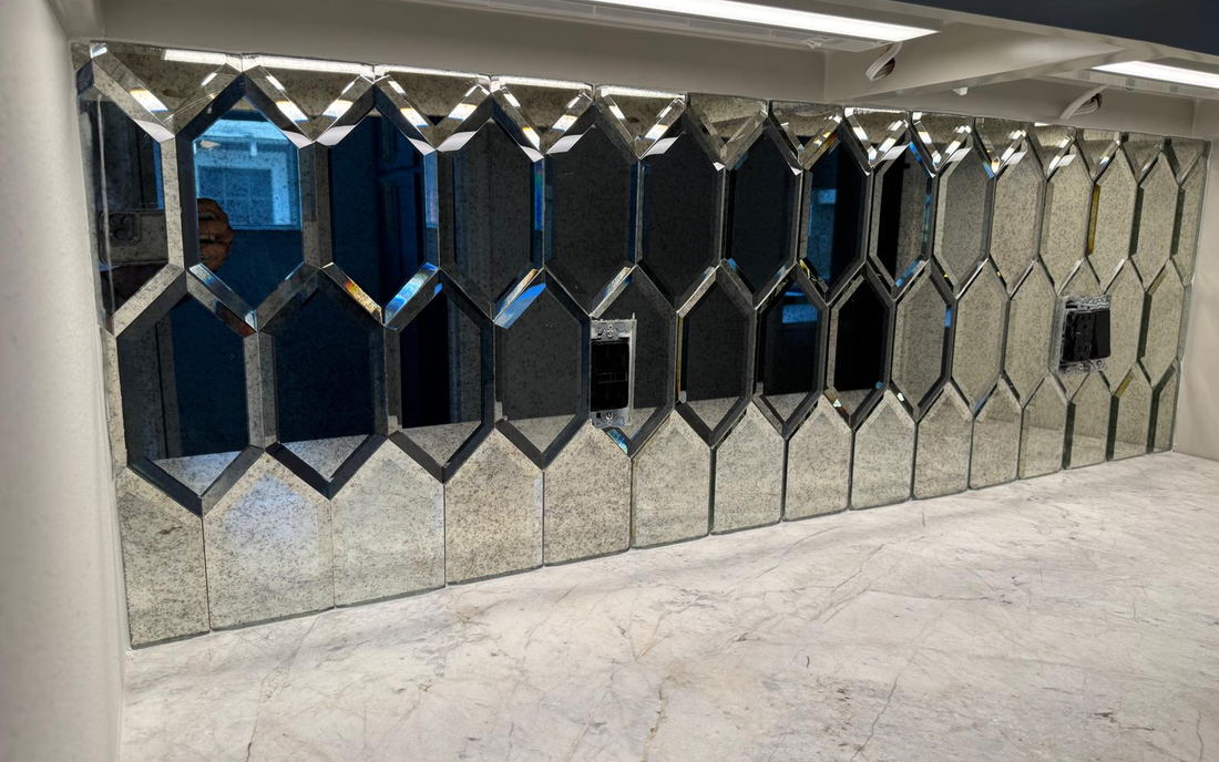
A backsplash sits at eye level under direct light, which makes electrical details unusually visible. Three things separate a clean job from a rough one.
- Box depth: boxes need extension rings so the device and plate sit flush with the new tile surface.
- Plate choice: oversized plates hide rough cuts but look bulky. Standard plates require accurate cuts.
- Orientation: rotating outlets horizontally in a subway layout aligns them with the joints and reads deliberate.
None of this is expensive. Extension rings cost a few dollars and take minutes if someone planned for them. They become a return trip if nobody did.
How the tile ends
Every backsplash has edges: where a run stops at an open wall, where it turns an outside corner, and where it meets a window casing. There are three good answers and one bad one.
- Matching bullnose: the cleanest look when the tile line offers it.
- Metal profile in a matched or contrasting finish: contemporary and available for any tile.
- Mitered corner: two tiles cut at 45 degrees, the most refined option and the most labor.
- A raw cut edge left exposed: the option that makes an otherwise good job look unfinished.
Decide this at selection time, because bullnose pieces have to be ordered with the tile and are frequently discontinued separately from the field tile.
What still looks right in ten years
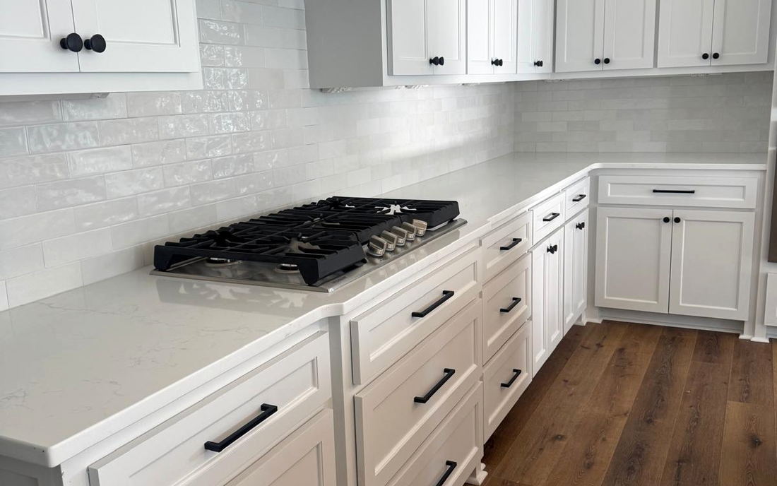
Looking back at kitchens we have tiled around Kenner and Metairie, the ones that aged best had a few things in common. The tile was relatively quiet and the layout carried the interest. The grout was matched or only slightly contrasted. The edges were finished with a profile or bullnose rather than improvised. And the pattern was centered on the range.
The ones that dated fastest were the opposite: a loud tile in a specific colorway, high-contrast grout in a busy pattern, and a mosaic accent strip at a fixed height in the middle of the field. The accent strip in particular anchors a kitchen to the year it was installed more firmly than anything else on the wall.
Questions we get on this
Neither, exactly. Pick one surface to be the busy one. If the counter has strong movement, keep the backsplash quiet. If the counter is calm, the backsplash can carry pattern. Two busy surfaces compete and the kitchen feels restless.
It gives a seamless look with no grout to clean and is the current premium choice. The considerations are seam placement, support behind the slab, and cost, which runs well above tile. It also has to be fabricated to fit, so measurements happen after the counters are in.
Usually yes. Removal takes care at the counter edge and the tile is cut to land cleanly on top of the existing counter with a silicone joint. We mask the counters fully and work off the wall rather than levering against the stone.